Citizen Portal UX and Accessibility Checklist for Government Sites
A practical checklist for building inclusive government portals — WCAG accessibility, mobile-first UX, multilingual content, and trust signals citizens need.
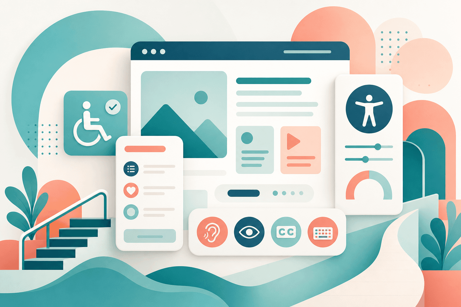
Citizens Are Not Power Users
Government portals serve everyone: first-time applicants, elderly users, people on slow mobile connections, and citizens who prefer Sinhala or Tamil. UX failures become service failures. Accessibility is not optional — it is a public duty and often a procurement requirement.
Accessibility Baseline (WCAG 2.2 AA)
Ship with these checks before go-live.
- Keyboard navigation for all forms and menus
- Sufficient color contrast on text and buttons
- Visible focus states; skip-to-content link
- Form labels, error messages, and ARIA where needed
- Captions or transcripts for instructional media
- Test with screen readers and zoom at 200%
Mobile-First Citizen Journeys
Most citizens apply on phones. Keep forms short, show progress, autosave drafts, and support photo uploads of documents without requiring desktop scanners. Offline-friendly confirmation pages reduce anxiety when connections drop.
Language and Trust
Provide full content in relevant languages — not just UI chrome. Show agency branding, contact channels, privacy notices, and clear status tracking. Citizens abandon portals that feel unofficial or opaque about what happens to their data.
Launch Checklist Summary
Validate critical journeys with real citizens before launch. Monitor completion rates and drop-off steps after launch. Treat accessibility bugs as P1 defects. Continuous improvement beats a one-time redesign every five years.
Frequently asked questions
Related articles
GovTech & Digital Government Transformation: A Practical Guide
A practical GovTech guide for Sri Lankan and APAC public sector leaders — how agencies digitize citizen services from strategy and procurement through delivery and change management.
Building an Electronic Certificate of Origin System: Lessons from Sri Lanka's eCoO
Technical and operational insights from developing Sri Lanka's electronic Certificate of Origin system for the Export Development Board.
eGovernment Procurement Software Guide: How Agencies Buy Successfully
How government agencies can procure digital systems that actually ship — RFP design, evaluation criteria, vendor risks, and delivery models that work in Sri Lanka.
Government Cloud and Data Sovereignty in Sri Lanka
How public agencies should choose cloud regions, hybrid models, and data residency controls when modernizing government systems in Sri Lanka.